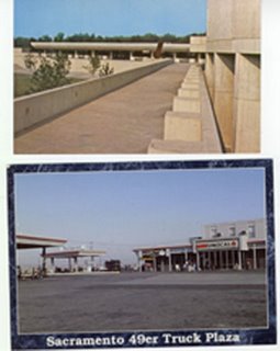
If anyone ever researches the extinct American culture in the millennia to come, it's difficult to know what they'd make of this. Actually, there's no need to wait that long; quite a bit of the country already appears to be in ruins.
For many years I collected postcards as cheap and portable souvenirs of my travels. I may post a few amusing foreign ones if I feel like it, but right now I'll concentrate on two horrors I found in my grandmother's button box this morning.
I used to send horrid things like this to friends in England and California. The joke was to send the ugliest and most pointless postcard. The Californian was able to come up with stuff that was just about as bad as this; my English friend invariably sent a postcard of HRH Queen Elizabeth II.
I didn't comment on his choice of subject matter.
These two never got mailed out for some reason or other. Both are at least ten years old. The abomination at the top is, or hopefully was, on the campus of the State Univeristy College at Fredonia, New York. The text on the reverse of the card reads," "The elevated walkway on the Fredonia campus stretches out toward Reed Library, one of the most modern collegiate library facilities in the nation. The flowing and classic design of the Academic Center of the college attracts many vistors each year."
Now, I've been to the college website, and there are pictures of the campus, and it looks a good deal more inviting than this horrible photograph. The wonder is that anyone ever found this style of architecture desirable. It might have been mitigated by the judicious application of plants; but there's not a sign of them. The 'walkway' looks about as inviting as a factory loading dock, only without the local color.
The 1970s were indeed the Decade that Taste Forgot: and the architecture of the time was probably the worst feature of a very ugly decade.
RIT was, my Chair joked, designed in 'American Brutalism" style, with tons of brick buildings and not much else when the campus opened in 1967. Say what you will, brick is more inviting than concrete, and I can only be thankful that the architecht(whom I curse daily for minimizing elevators and climbable stairs and including Arizona-style BREEZEWAYS in buildings that regularly suffer high winds and the deep snows of an upstate winter) did not choose to use poured concrete instead of the bricks. That's his one saving grace.
RIT has very pleasant squares and landscaped grounds around the brick buildings that were added over the years which soften the 'factory' look considerably. I'm also glad that our building has flags on the front so people can identify where it is.
Anyway, the second photo was picked up at a truck stop near Sacramento. I really did stop here, and it is really as ugly as you see here.
Actually I thought most of California must have been lovely at one time, but people had been working overtime to correct that condition.
No comments:
Post a Comment